Abstract Magic Brushes
A lot of the time I sit in front of the computer at a blank document and wonder where the heck do I start? There’s nothing more frightening than a blank screen to a creative type who needs to be doing something creative. And yet, these are also the best times for finding out new and interesting ways to use Photoshop. This is how I came up with the concept for this tutorial. I just started playing around in Photoshop and let my mind wander, and it turned into something that I felt was a new and unique way to create a one-of-a-kind brush in Photoshop. Better yet, it’s simple, creative, and kind of fun. Plus it lends itself to exploration. Something we all need to do from time to time.
In this tutorial we are going to take two tools in Photoshop that have no business being together, and merge them to create a unique abstract brush. The two tools are the Magic Wand, which selects color ranges within your image, and the Brushes Palette (the place where just a little change can go a long way). So let’s dig in.
Step 1
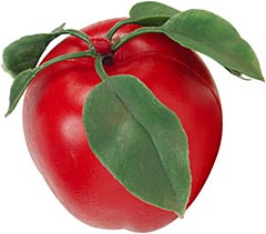
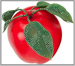
First, open an image of your choice. It can be any image you like, just make sure it doesn’t have flat color or tone. An image of a face works perfectly for this exercise. Since I didn’t have one handy, I chose to use a free stock image of an apple:
Step 2
The next thing we want to do is select the magic wand in the toolbox.

Step 3
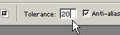
Next, under the Magic Wand options in the toolbar, select a tolerance between 5 and 30. This is going to be highly dependant on your image and how much tone/color it has, but experiment with these settings. Since we want an abstract effect, there’s really no right or wrong setting here. But start out with something around 15 or 20 and go from there.
Step 4
You can elect to make the selection contiguous (selections will be made only from one area that is localized) or uncheck the box and make your selection non-contiguous (selections will be made from all areas of the image where your color exists — the selection is not a closed selection, but rather can be broken up across the entire image). Here I started off by selecting Contiguous.
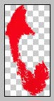
Step 5
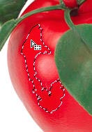
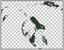
Now click in a location within your image, and your selection appears. In this case, I have a pretty abstract selection of part of the apple.
Step 6
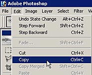
Next, go into Edit -> Copy or click Ctrl/Command+C to copy the selection.
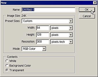
Step 7
Click Ctrl/Command+N to bring up the New document dialog. The dimensions of the selection are already entered for you because Photoshop is smart enough to figure out that you probably want a new document the same size as the contents of your clipboard. This is a nice automatic feature indeed. Click OK.
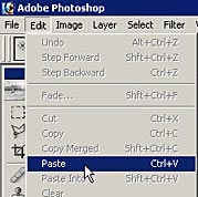
Step 8
Next, go to Edit -> Paste or click Ctrl/Command+V. The contents of your clipboard selection is entered into the new document.
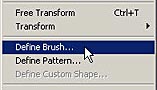
Step 9
Next, go to Edit -> Define Brush. This defines the entire contents of the document as a brush.
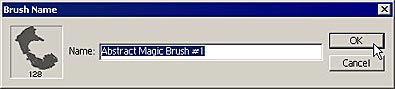
Step 10
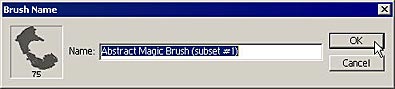
If you wish, enter a name for your new brush. Then click OK.
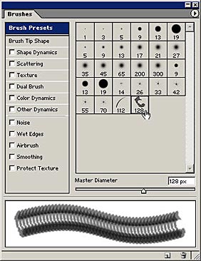
Step 11
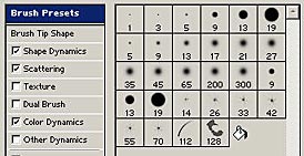
Open up your Brushes palette (not the Brush Preset palette, but the larger palette with complete brush options for you. Notice your brush is at the bottom of the preset list. Here is what my brush looks like, with a nice little preview at the bottom.
If you like the brush, you could stop there, however, the real fun part about brushes is the ability to create a wide variety of effects from a single type of brush. You have texture, angle, color, and Scattering dynamics to name but a few of the powerful options. So let’s start playing around with these options and see if we can create an even more abstract brush.
Bear one thing in mind: as soon as you change any settings for your brush, you will need to resave it or save it as a new brush entirely. If you don’t do this, all your settings will be lost as soon as you switch to a different brush. So if you hit on some settings you like, always remember to save the brush again.
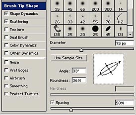
Step 1
I’m going to start by going into the Brush Tip Shape options, and enter a spacing of 50%, which spaces out the brush a little more as you paint. In addition, I’m going to change the tip shape and direction by moving the image of the brush tip to a 33 degree angle and a roundness of 36%. This makes the brush a little more oval, rather than round.
Step 2
Next, I’m going to select the Shape Dynamics. Remember that you must click on the Shape Dynamics name, and not the checkbox, which only applies the shape dynamics from the last time you set them up. This is similar to the way the Layer Styles dialog works.
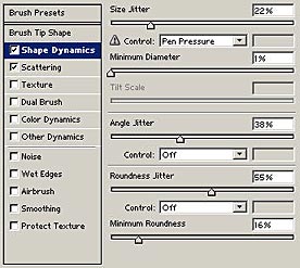
Step 3
For my brush, I entered a Size Jitter of 22%, Angle Jitter of 38%, Roundness Jitter of 55% and Minimum Roundness of 16%. Remember there are no hard and fast rules when it comes to creating these brushes, so experiment with these settings to see what they do.
Step 4
The Size Jitter fluctuates the size of the brush, the Angle Jitter fluctuates the rotation of the brush as you paint, and the Roundness Jitter fluctuates the roundness of the brush tip. All this amounts to a more random brush stroke as you paint.
Step 5
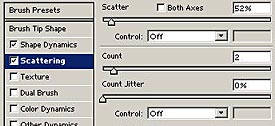
Next, select the Scattering options. Scattering options fluctuate how widely the brush is scattered on the canvas. The higher the Scatter, the more random and spaced out the brush stroke becomes. If you want both the x and y axes to be scattered, place a checkmark in the Both Axes checkbox.
I also raised the count to 2, which means that the brush stroke becomes more dense on the page. The great thing about changing brush settings is the fact that you can see it being updated in the brush preview at the bottom of the dialog. Keep in mind, though, that this preview is not always 100% accurate. You may need to tinker and fiddle with your settings until you achieve the desired result. One good thing to do is to always test your brush on a large canvas, either once you’ve entered all your settings, or during the process of selecting your settings.
Step 6
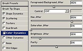
Lastly, select Color Dynamics if you want to play with the color of your brush. Unfortunately the Color Dynamics are not previewable, however, the more you experiment with these settings, the more intuitive they will become for you.
Here are my settings for the color dynamics. The Foreground/Background Jitter will fluctuate between the foreground/background colors you select in the toolbox. I also made sure that the Hue is fluctuated as well, by raising the Hue Jitter up to 80%. Finally, I increased the Brightness jitter to 18%.
Step 7
When you are done, go back to the Brush Presets section of the dialog, and hover your cursor over the blank area (shown below). Your cursor changes to a paint bucket where you can save the new brush with your new settings.
Step 8
Once again, give your brush a name and click OK.
Step 9
If you don’t want to keep the original brush, just hold your cursor over the brush in the brush presets, and hold your Alt/Option key down. The cursor changes to a pair of scissors where you can delete the preset.

Step 10
Now to test your new brush. Select a foreground and background color. Remember that since we provided settings in the brush which fluctuate your color, the foreground/background you choose will influence the color of the paint stroke.

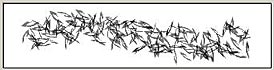
And here is my final test for my magic abstract brush:
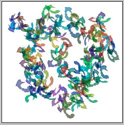
I also decided to add a little flare to the layer by introducing a layer style to the brush stroke.
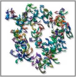
Finally, I decided to create another brush out of the same "apple" brush, only this time I chose a few different settings to create the following effect:
You can create an endless variety of brushes using this method. Here are the previews of both my brushes, so you can see what they look like in the preview, and when painted (above).
Here are a few other quick suggestions. By unchecking the Contiguous option for our magic wand, we end up with the following selection:
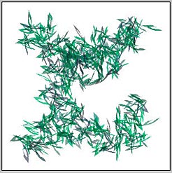
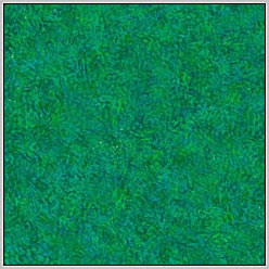
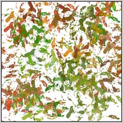
If I paint using this type of brush, and stroke over the entire surface of the new document, I end up with an interesting colored texture. These can be handy for web page backgrounds or texture mapping onto 3-D objects.
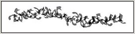
Here is the same brush, only this time I chose not to saturate the entire document. Notice how the non-contiguous approach provides for a much more rough paint stroke. Sometimes that is the effect you are looking for.
I hope you enjoyed this tutorial. And I hope it gave you a new prespective on creating brushes and using them to create something unique. Until next time, good luck in all your Photoshop projects!