Infrared Imagery
Infrared is a whole new way of seeing the world that wouldn't be visible with the human eye. Most people associate this with high-tech binoculors that see images at night, and yes that is definitely one way to look at it. But on a more artistic and practical note, infrared is a wavelength of light that is not detectable by the naked eye. Over the years special films were developed that were able to capture this sensitive wavelength of light and produce an image from it. Now in comes photoshop to help produce images of almost the same quality, or what I call near-infrared or pseudo-infrared imagery.
As with any photoshop trick, you will always do better shooting your image with infrared film, and anything you do in the application is always going to fall short of what could be done through traditional methods. But unless you have a super-sensitive eye for it, you just won't notice the difference. And for the majority of people, this is enough. Not to mention it's an efficient and cheap way to go. No film, no processing fees, and you can process your photo in an endless variety of ways.
Incidentally, the human eye only sees colors in a very narrow band of the spectrum. There is a whole range of light that goes completely undetected by the human eye. And technology can help us to view these other spectral arenas. So here is how you can create your own infrared image without the film and without the cost. Furthermore, you can apply this technique to any color or Black & White image.
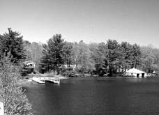
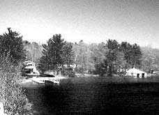
There are two main areas I work with when Trying to acheive an infrared effect. The first is the Channels palette, and the second is the Levels dialog. Sometimes Curves can be helpful, but usually working with Levels produces the results I want. Here is the original image that I started with.
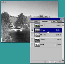
You can work within RGB mode, viewing the 3 different color channels, however, I find that you can get more flexibility by switching to CMYK mode, simply because there is an extra channel of color information to choose from. However, try looking at each channel separately, both in RGB and in CMYK mode, and look for the channel that has the best range of gray. If you click on each channel, the image is viewed in Grayscale by default. You can change this setting in your Photoshop Preferences (Edit - Preferences - Display & Cursors). The topmost Channel is a combination of all the color channels, and therefore, clicking on it will display all the colors in the image together. This can be confusing, and takes a while to get used to.
Step 1
For this image the Cyan channel within the CMYK mode and the Green channel in RGB mode looked promising, so here I will show you both. First, switch the image to CMYK Color mode by going into Image - Mode - CMYK Color. The image now has 4 color channels: Cyan, Magenta, Yellow, and Black.
Step 2
Now that you have chosen the color channel, make sure you are viewing only that channel. Just select it in the Channels palette. Then go into Image - Adjustments - Levels. Adjust the Input Levels until you have the desired effect. This is a matter of personal taste. And it's good to get to know the Levels dialog, as it is useful for adjusting the tones and detail within your photos.
I will not get into a full discussion of the Levels dialog here, however if you adjust the Input Level sliders, the histogram (graph) goes from Black to White (right to left), with the midpoint being the gray median value.
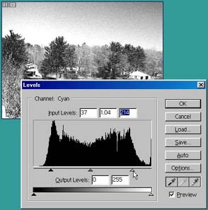
A general rule of thumb is to have an even range, or a graph that is evenly distributed all the way across. If the graph drops off either on the right or left sides, this means you do not have a full range of tones in your image. Either your blackest points in the image are not as black as they could be, or your whites are not pure white. Notice how I pulled the two outer arrows toward the center to where there was more color information (where the graph starts to peak). I then brought both the black and white point arrows even further into the center to exaggerate the tones to acheive a somewhat infrared exaggeration. And to make the image more interesting.
Step 3
Click OK when you are finished adjusting the levels.
Step 4
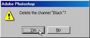
Now delete all but the Cyan channel from the Channels palette. A message prompt will show up asking if you want to delete the channel. Click Yes to accept the deletion. This will happen each time you delete a channel (below).
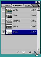
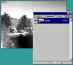
When you have finished, you will be left with only the channel you want, in this case the Cyan channel.
Step 5
Next, convert the channel to Grayscale mode by going into Image - Mode - Grayscale. Then save your image. The final photo is shown below.
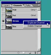
Using the Green channel in the image to acheive a similar infrared effect is somewhat the same, however you need to be a little more careful when deleting your channels because deleting an RGB channel automatically renames all other channels to their CMYK equivalent, and this can be confusing.
Step 1
First we'll start out with the full RGB image (if your image is in a different mode, switch to RGB Color by going into Image - Mode - RGB Color).
Step 2
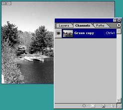
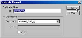
The next step is to eliminate the naming confusion by stopping it before it begins. Simply duplicate the channel you are going to keep, in this case the Green channel. If you wish, provide a new name for your layer, and click OK (shown below).
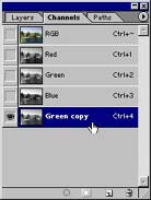
You now have a fourth channel within your Image: the Red, Blue, Green, and the copy of the Green channel (below).
Step 3
Now, you will need to delete all the other channels, just as you did for the CMYK version of the image. To delete the channels, drag each channel into the trash icon, or else select the channel and click on the trash icon.
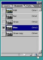
Notice that when you delete one of the RGB channels, all other colors are renamed to follow CMYK conventions. This is why you created the duplicate Green channel. So you can tell the difference.
Step 4
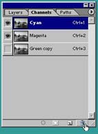
Delete the rest of the channels in the same manner, leavingonly your channel copy. When you are finished, you will have something that looks like the image below.