Sepia Toning
Sepia-toning gives your image an antique feel to it by adding a specific color to a Grayscale (Black & White) image. Essentially, it colorizes it with one or two warm or cold colors, while maintaining the overall look of the gray within the photo. You can use any color to create a sepia-tone, and the beauty of doing it in Photoshop is its versatility of choice when it comes to the colors you can select from.
As with any other operation in Photoshop, there are unlimited ways to achieve your effect. Here are two very simple ways to create an image that has a sepia tone quality.

Make sure to start in RGB color mode. If your image is in color, you should already be there. If it is Black & White, first go into Image - Mode - RGB Color. My original image is shown above.
Step 1
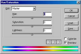
Begin by going into Image - Adjustments - Hue/Saturation, which opens a dialog box where you can affect the color and lightness of the image.
Step 2
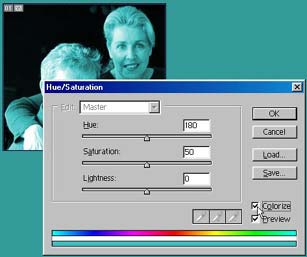
Next, click on the Colorize box in the bottom right corner of the dialog.
Step 3
Once that is done, you can affect the Hue and Saturation sliders on the dialog. The lightness setting is not relevant for this exercise, as it has no bearing on the color of the image, as you will see. For a classic Sepia tone (which usually consists of a light brown/yellow color, set the Hue to between 10 and 80, and the Saturation to between 10 and 25. This will give you the desired effect (shown at the bottom of the page).
Don't stop there, however. You can acheive a lot of very interesting color tints using this method. Experiment and you will find numerous color variations can be applied to the image. Take a minute to look at the Hue/Saturation dialog. It can be confusing if you don't know what you are doing. With the Colorize box checked, the Hue varies the color range from 0-360, so it is good to think of Hue as a giant color wheel that rotates around in degrees. The Saturation can be modified from 0-100, so think of this as the percentage of the color you want to have in your image. It is actually not going to affect the kind of color, but rather the percentage of depth the color has. That's the best way I can describe it. For interests sake, the Lightness setting goes from -100 - +100, from very dark to very light. Negative means less light, hence a darker image, and positive means more light or a lighter image.
With the colorize box unchecked, you are working with the image's complete range of color data, and the Hue/Saturation sliders change accordingly. The Hue slider now works from -180 - +180, and the Saturation slider functions between -100 - +100. The Lightness slider works the same under both conditions, because if you think about it, the lightness would operate the same under multiple colors or a single "colorized" setting.
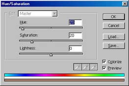
The following shows different Colorizations that can be acheived using the Hue/Saturation method. This is by no means a definitive list, but will give you some idea as to what can be acheived through variation. I personally like the Cooler tones for this image.
 Classic Yellow Sepia Tone (Hue: 34; Saturation: 25) |
 Warm Umber Sepia Tone (Hue: 20; Saturation: 20) |
 Cool/Warm Red Tone (Hue: 0; Saturation: 22) |
 Cool Green Tone (Hue: 122; Saturation: 12) |
 Cool Blue Tone (Hue: 220; Saturation: 11) |
|