Creating a Photo Frame (Part 2)
Adding the Bevel Layer Styles
At this stage of the game, you really don’t need me anymore. You can add your Layer Styles to any layer and try out various combinations. However, I will give you a few suggestions and considerations that you might want to keep in mind as you finish off the frame.
Step 1
First, select the Image Layer. We’ll begin adding our effects here. Access the Layer Styles dialog by double-clicking on an empty portion of your Layer or by clicking on the "Add a layer style" icon at the bottom of the Layers Palette and selecting "Stroke". I am going to add 3 effects to this layer, and explain why:
Step 2
We need to add a Stroke to the edge. Since the entire framing for your image is fairly small (100 pixels on either side), I would use a relatively low setting in the Stroke dialog. For a color I would select a light color from the Wood pattern so that it blends in a little more smoothly. To do this, double-click on the Color swatch in the Stroke dialog. Forget about the Color Picker dialog that opens, and instead hover hover over the image and click on a light color. When this is done, click OK in the Color Picker to return to the stroke dialog. Keep the setting of 3 for the size, and make sure that the stroke position is Outside. If you don’t select Outside, the stroke will fall over the image, thereby clipping parts of your image that you may not want clipped. This way, the stroke will fall into the frame area. Keep all the other settings as is.
Step 3
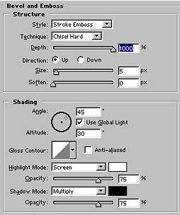
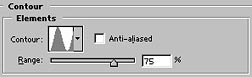
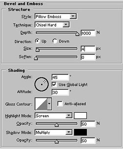
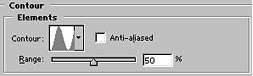
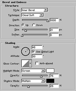
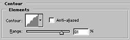
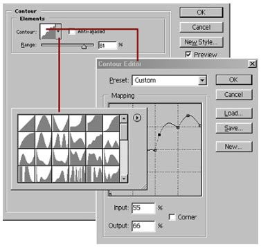
While you are still within the Layer Style dialog, click on the Bevel and Emboss setting. Be sure to click on the name and not the checkbox in order to access the Bevel and Emboss options. Enter the options below, then click on the Contours setting and enter the options for the Bevel Contour (also shown below).
Step 4
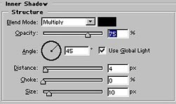
Next, select the Inner Shadow settings, and change the Distance and Size settings to fit the size of your image. If you are working in a large image, you should set the Distance and Size higher than if you are working in a smaller image. I would leave all the other settings as is. The reason we add an inner shadow to the image is to create a shadow under your inner frame. This makes the image look a little more realistic. The downside to using the inner shadow is that it will hide a portion of the image on the image layer. But you can decide for yourself whether you want to add this into your layer style or not. Personally, I opt for a little more realism over hiding the edge of the image.
Step 5
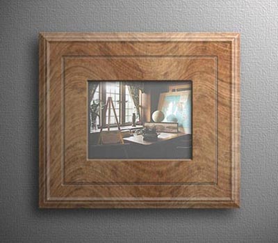
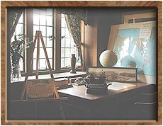
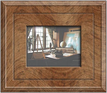
When finished, click OK to exit the Layer Style dialog box and have the Styles accepted. The image will look like this (minus the white border which I only put in to highlight the frame):
Step 6
In the next step, we need to add a Bevel in the middle of the wood. This will create a bevel between the two frame layers (in the middle of the overall frame around your image). I like making this bevel very small and light, so that it is subtler, and then leaving the outer frame edge for more ornate and larger bevels. Also, I find that the "Pillow Emboss" setting works well for the middle area of any frame. It provides a more realistic effect by displaying the effect as though it was pushed into the pattern on both sides. But again, find your own style. If you like things a little more crazy, change the Contour setting (not the Gloss Contour setting). This will change the contour of your Bevel, without changing the coloration of the entire layer (ie: it only changes the outer edge of the layer). You have all the tools at your disposal to make Large Bevels, small bevels, embossing, and even satin effects with Outer and Inner Glows. Experiment and you will find a variety of combinations.
Step 7
Select the First (Inner) Frame Layer directly below the image and enter the Layer Styles dialog box. Add the following settings for both the "Bevel and Emboss" and the "Contour" style effects:
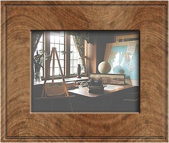
Your image should look something like the following:
Step 8
Next, select the Bottom Layer (Outer Frame), and enter the style dialog box here. Again, we are going to add "Bevel and Emboss" and "Contour" settings for this layer. This time, I am going to use the Inner Bevel setting and give it a little larger size as well as a little flare by using the "Rounded Step" Contour that ships with Photoshop.
Step 9
Enter the following settings for both the Bevel and Emboss, as well as the Contour Layer Styles:
And Here is the final result (again, the white outline is simply to highlight the frame):
Accessing Photoshop's Layer Style Contours
All the contours I’ve used in this tutorial are accessible by clicking the drop-down arrow on the Contour setting. Adobe ships with some pre-defined Contours that are already built into the program. If you click on the contour swatch itself, the Contour dialog opens, and you can edit the Contour. I urge you to get familiar with this dialog – it works just like Curves, and will provide you with a variety of useful Bevels for your frames.
Adding a Canvas Background
To put on some finishing touches, you could decide to put the frame on a Canvas background. This gives the image that extra oomph that brings out a little more realism to the image. Here's a quick method to do that.
Step 1
First, click Shift+Ctrl+E or go to Layer -> Merge Visible to merge all the visible layers. Don’t flatten the image, because that will throw everything onto a background layer, and you want everything on a normal layer.
Warning: Editing Down the Road
If you want the ability to edit the Image frames later, save a copy of your image before you merge the visible layers. This way you can go back to the original image with all the layers intact, to try different variations on the bevels or to modify the patterns. If you just accidentally merged your visible layers as I showed you in the step above, simply go to Edit -> Undo, then save a copy of your image. Now you can safely merge the visible layers again, without fear of losing the image layers for future editing.
Step 2
Next, create a new layer and move this layer to the bottom of the layer stack.
Step 3
Now, go to Image -> Canvas Size and enter the desired amount of pixels for your background canvas. To make it 100 pixels wide all around, select the Relative checkbox, and enter 200 pixels in both the Width and Height fields.
Step 4
Let’s create a middle gray backdrop. Go into Edit -> Fill and select 50% Gray. Click OK. Your background layer is filled with a flat gray tone.
Appropriate Background Color for Photos
Usually the best color to use for a background which displays photos or a photo gallery is 50% gray. This is because any image of any color will be viewed well next to a middle gray. Of course, there are no hard and fast rules, and if the image is mostly comprised of middle gray, a different color should be used.
Step 5
Next, go to Filter -> Texture -> Texturizer, and select Canvas for your base texture. Leave the Scaling at 100%, and set the Relief to 4. For the Light Direction use "Bottom Left".
Step 6
Unless you like your texture very defined and prominent, go into Edit -> Fade and select an Opacity of 50%. This lessens the texture and makes it look a little more faint behind the image. Sometimes, subtlety is a good thing, and the last thing you need is for the background to detract from the image you are trying to display.
Here is the image so far: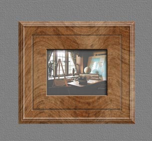
Final Touches with Light
If you look closely, you’ll notice that something just isn’t right. The image and the frames look fine, and the background looks good, if a little flat. So what would make this a little more realistic? How about if we add a shadow between the frame and the background layer, and then add some lighting effects to the Entire document. Let’s see if we can add that little extra to provide a realistic look.
Step 1
First, select the merged image/frame layer.
Step 2
Go into the Layer Style dialog box for this layer (double-click to the right of the Layer name or access it via the icon at the bottom of the layers palette and select "Drop Shadow".
Step 3
Enter a Distance, Size, and set up your angle of rotation.
The distance and size will be determined by how large your image is, so there are no strict rules. Leave all the other settings as is, and click OK to have your settings take effect.
Step 4
Merge the Image with the background by going to Layer -> Merge Down.
Step 5
Go to Filter -> Render -> Lighting Effects, and enter the settings shown below. You can use any type of light source you want, and create a variety of Gallery lighting effects and angles. You can even create multiple lights from above or below.
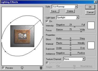
For this image, I decided to use a single light that came from the top. The only thing you have to be careful of is making sure all the outer shadows follow the same direction, and all the inner shadows follow the same direction.
Of course rules are made to be broken, and to add my own artistic non-conformity, I made sure that the inner shadow (remember the shadow that overlaps the center image?) goes in an opposing direction to both the lighting effects we are applying here, and the outer shadow of the frame. Perhaps I just wanted to make a point and show you that in art, you never need to conform? So with these final touches applied, here is the image presented with our frame, backdrop and lighting effects: