Creating a Color Scheme
Photoshop is a truly amazing program. You can edit photos, arrange elements on layers, add styles, create textures, retouch photos, pick and choose any color you like, and a myriad of other assorted things. But from what I’ve seen, most of the educational focus is on one of two things: Photo Retouching and Cool Special effects. In addition, I’ve read over 50 books on Photoshop, and the majority of the material focus on basic skills that can easily be found by reading the documentation that comes free with Photoshop.
Don’t get me wrong, there are several books out there with good intentions, and every once in a while I will read something that really inspires me or sends me in a new direction. But I would really like to see some advances in the material being presented. I’m often found scouring the web for tutorials that break out of the mold and teach you something truly unique, useful, and intriguing. I believe it is with those three things that a really good writer/teacher is found.
That being said, I hope this tutorial will give you a bit of all three. It’s not anything earth-shattering, but it’s something that I’ve yet to see demonstrated anywhere else. In this tutorial I’m going to take a step back and explore a little known functionality of Photoshop, and that is its ability to create color schemes or color harmonies.
What do I mean by this? Well, let’s say you have a website or a print project, and you have explored your layout. You know what you want to present, and you may even have all the elements that you want to put together ready to go. But what you don’t have is a color scheme. A few matching colors that look good together. Colors that will pull out the presentation and work together to produce a good design. I used to struggle to find good color combinations. But after a while I started thinking that there may be a better way to design. There may be a quick solution for finding colors that look good together.
So I started reading some books, and talking to other designers, and what I found inspired me to try to work Photoshop into providing me with color schemes. Adobe has dabbled with this concept before: in an old program called ImageStyler, there was a color scheme palette which produced a variety of colors (6 in total I believe) that were based on a single color which the user chose. When ImageStyler went the way of the dinosaur, LiveMotion took over and adopted this Color Scheme palette. I’m not sure if it is still available in this program or not, but I can tell you there are several color schemer programs and applets out there that will do all the work for you and charge you a fee for your lack of knowledge.
In reality, creating a Color Scheme in Photoshop is probably one of the easiest things to do. All it takes is a little basic understanding of Color Harmonies and how to translate them into the Hue/Saturation dialog. I’ll show you how to do that. In addition, you can download my free set of Color Schemer actions which do the work for you. If you download them, I urge you to review the steps in the action and see how the colors are being created. I also urge you to find your own color combinations that work for you. There are no hard and fast rules when it comes to color selection, but there are some general guidelines that you can follow.
Traditionally, there are a few basic color harmonies. This is not an exhaustive list, however, the most common are as follows:
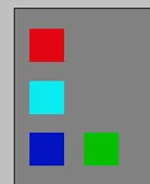
- Complementary: This scheme uses two colors which are directly opposed on the color wheel
(for example: Red and Cyan)

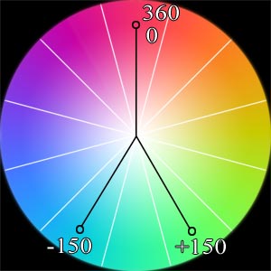
Split Complementary: This scheme uses 3 colors. One color and two other colors that are directly adjacent to its complement on the color wheel (for example: Red, Cyan-Green, and Cyan-Blue)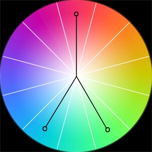
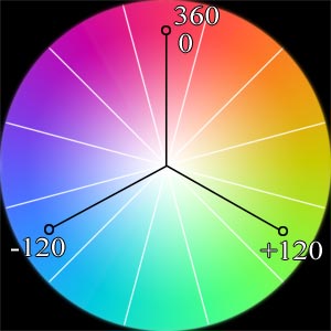
Triad: This color scheme uses 3 colors that are equally spaced out on the color wheel (for example: Red, Blue, and Green)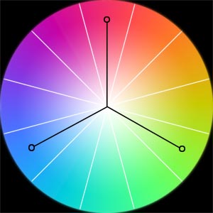
Analogous: This scheme uses three colors, one that is in the center, and the two colors adjacent to it on the color wheel (for example: Red, Red-Orange, and Red-Violet).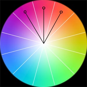
Monochromatic: This color scheme uses colors from the same Hue on the color wheel, but with varying saturation and/or lightness (for example: different shades or tints of red).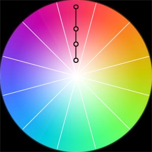
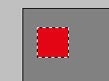
These color schemes are what’s known as "harmonious" color combinations, or colors that are in tune with each other, and look extremely presentable when used in tandem. Most any other color combination produce "discordant" color schemes, meaning the colors are less in tune with one another. Since color is a subjective thing, you are the best judge on what works and what doesn’t. However, there are simple principles you can follow to achieve better color schemes than others. Without getting too heavily into the subject, let’s take the following example:
Which image looks better to you? Most people will say the image on the left looks better, and they would have 400 years of tradition on their side. The reason is simple science. By creating Red text on a Cyan background, we are creating a complementary color scheme (Red’s opposite–complementary–color is Cyan). When we place the same red text on a pure blue background, the colors begin to vibrate and the text becomes unreadable. This is because blue is a discordant color in relation to red, and we have set up a discordant color scheme.
By taking this theory a step further, we can easily recreate these schemes (and any others) in Photoshop.
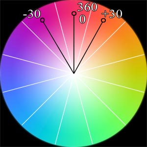
In order to do that, we must first translate our Color Wheel into the Hue slider on the Hue/Saturation dialog. Here is how it’s done:
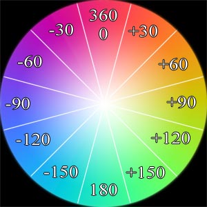
There are two main things to note at this point:
- The Color Wheel (which is circular) is translated
into the Hue/Saturation dialog (which is linear). This is why +180 and
–180 on the Hue slider in the dialog will give you the same color. Just
as 0 and 360 on the color wheel give you the same color. Just keep in
the back of your mind that adjusting the linear Hue slider actually moves
the colors around the color wheel in a circle.
- The Hue/Saturation dialog uses relative color shifting. This means that whatever color you initially select, the numbers in the color wheel shift relative to that color. For example: the above color wheel is valid only if Red is your starting color. If you select Blue as your starting color–located at position "–120", all the numbers will shift so that Blue becomes the new "0/360" position (all the other numbers above will shift accordingly). Note that it is not the colors that change, but the numbers that calculate the colors. The color wheel itself stays constant. By contrast, if the Hue/Saturation dialog used "Absolute" color shifting, then the color Red would always be located at position "0/360".
It is this second point that is the key to unlock the power of Photoshop when it comes to creating color schemes. Since the numbers will shift depending on the color you initially select, you can easily create an action that finds all the appropriate color schemes based on a single color of your choice. Once the action user selects his color and places it as the foreground color, you can have the action create a new document and place all the colors in any of these color schemes into this document as swatches of color. The end result is a useful timesaver to pick all the color harmonies.
Here are the Color Scheme locations in relation to the sliders on the Hue/Saturation dialog. Note that all schemes except Monochromatic use the Hue slider to find the appropriate colors. Indeed this is really the only slider you need to adjust for most of the color schemes.
Complementary Color Scheme: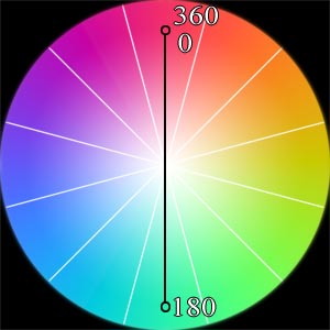
Split Complementary Color Scheme:
Triad Color Scheme:
Analogous Color Scheme:
Monochromatic Color Scheme:
Here is a step-by-step process that I used to create my action that finds all color combinations based on the methods above:
Step 1
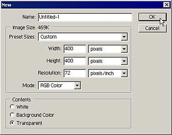
First, create a new image. 400x400 pixels should give us enough room to work comfortably.
Step 2
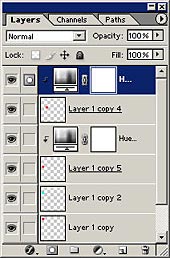
Next, fill the layer with 50% gray. This is good because we can view our colors against a neutral background. When that is done, create a new layer, and make a simple square selection on the new layer. We are going to place each of our colors on a different layer so they are easy to manipulate.
Step 3
Next, fill the square with any color. This will be the base, or original color that will be used to base all other colors within the color scheme. Be sure to keep the selection active during this process.
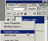
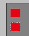
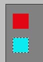
Step 4
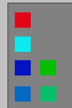
Next, duplicate the color layer. Move the square below the original color. This is going to be our complement color. On the duplicate layer, click Ctrl/Command+I to get the inverse of the original color. If you like, you can label this layer "Complementary". In our example below, since Cyan is the complement to red, the square is filled with Cyan.
Step 5
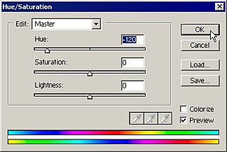
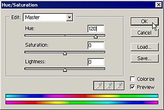
Next, create 2additional layers and move them below the two color squares. These will be our Triads. Be sure they are the same color as the original square (red in this example).
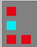
A triad is a group of three colors that are separated on the color wheel by 120 degrees in either direction. So the easiest way to create your Triads is to use the Hue/Saturation adjustment layer over each of the two squares and change only the hue by a positive 120 and negative 120 respectively. Since the Hue/Saturation dialog shifts colors relative to the original color, you will achieve the correct results because you are moving 120 degrees in either direction relative to the original "red" color.
Step 6
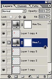
When you are done, group these layers with their respective color squares by holding the Alt/Command key and hovering your mouse over the line between the adjustment layer and the layer below. When you see the link cursor, click with your mouse. This will group the adjustment layer with the layer below it. You can merge each of these grouped layers down if you would like to save space and reduce the number of layers in your document.
You now have the two additional colors to make up a traditional triad (these two colors plus the original red color make up the triad).
Step 7
We’ll work on the Split Complements in the same way. Split Complements are separated by 150 degrees on the color wheel in either direction, so perform the same operation as you did with the split complements, only this time change the Hue in the Hue/Saturation dialog by negative 150 and positive 150 degrees in either direction. You will end up with the following diagram:
Step 8
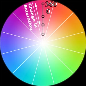
Next, let’s try our hand at Monochromatic colors. Monochromatic colors simply mean the same hue, but a variation in the tint, shade, or saturation of the color. These are perhaps the easiest colors to recreate, the only difference is that instead of changing the Hue, you will need to change the saturation. Note that you can also change the lightness slider as well, but I would start off slow and change the saturation in any increment level you like.
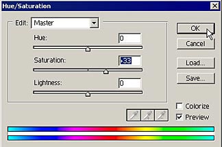
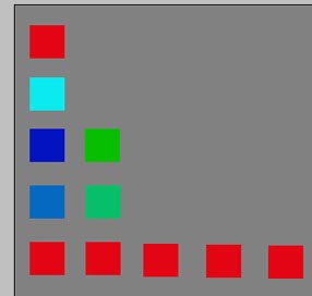
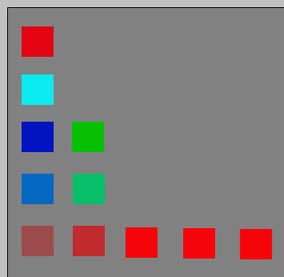
You should also bear another note in mind as you do this exercise. Depending on the color you first select as your original base color, it may already be saturated in a specific direction. For example, the red I chose is highly saturated, so that increasing the saturation upward (shown in the image below left) will not yield any increase in saturation (we have already selected a highly saturated color). Note, however, that decreasing the saturation in the red squares at the bottom left yields a change in the saturation of the color. So it’s a good idea to produce color squares that yield both an increase in saturation results, and a decrease in saturation results, so that whatever color is chosen, you will get at least one or two results from your monochromatic colors. In this respect, finding monochromatic colors is hit or miss when you create a color schemer action such as the one I’ve created. However, if you are doing things manually, you can see the increase/decrease in saturation on-screen as you adjust the saturation slider.
Step 9
Lastly, follow the same steps to produce Analogous colors by increasing or decreasing your Hue slider to +30 and –30 respectively. In the action I created, I also included two other analogous colors with +60/-60 Hue shifts just to make it a little more interesting.
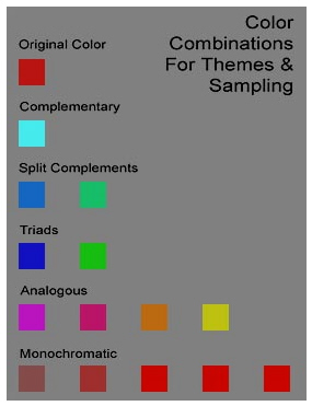
Here are the results of the action when it was run using red as the original color. This automatically creates the Complementary, Split Complementaries, Triads, 5 Monochromatic colors, and 4 Analogous colors of the original color. Depending what color you initially select in your foreground, the results will be different each time. Once the action is run, you can sample from any of the squares to place the color in your foreground, or save the colors in your Swatches palette.
So where do you go from here? Well, you can save this document as a color reference where you can sample colors, or you can sample each color and create customized swatch files out of the created colors. I guarantee this method will be a great way for you to build your own color schemes for your web pages, designs and layouts, and it sure beats the hunt and peck method to find colors that work well together.
I hope you find this tutorial useful. Feel free to download the action here. And try creating your own color combinations based on the hue/saturation dialog, or even try applying the same methods to the channel mixer dialog to come up with some interesting results. Until next time, good luck with all your Photoshop projects.